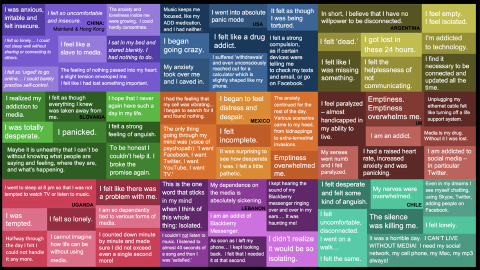
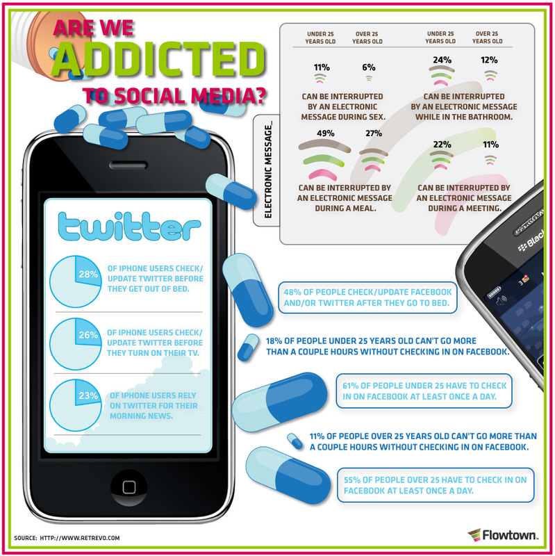
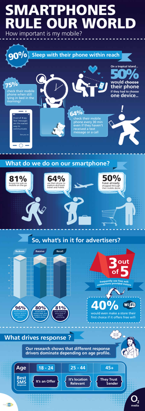
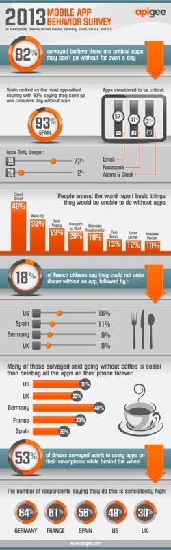
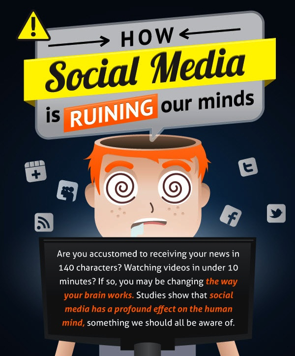
After having researched David McCandless' 'Information is Beautiful' last semester in the Ideas into Reality module I thought that info-graphic posters may work well with the chosen topic. I have researched numerous info graphics for technology addiction for inspiration, here are a few...
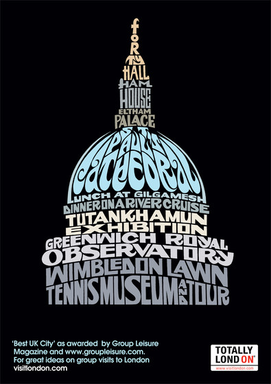
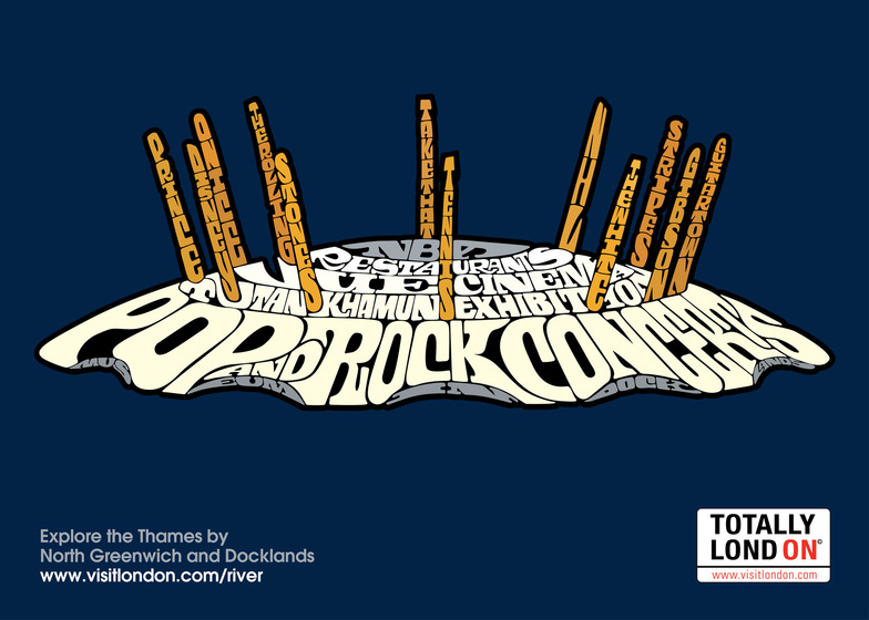
I thought it would be a good idea for familiarise myself with other existing posters that have been used for technology addiction campaigns. In my opinion, these below are the ones that are more effective and make more of an impact.
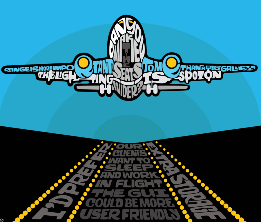
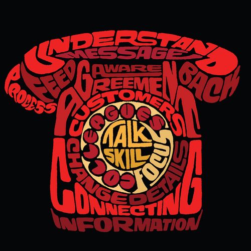
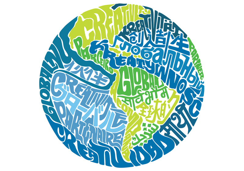
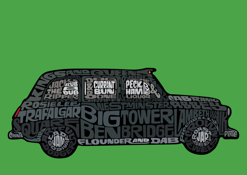
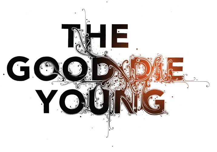
When I first saw a piece by Oscar Wilson I INSTANTLY fell in love with it. His design are so eye catching and memorable. Out of all of the designers I have looked at for this module, Wilson's designs are always the first ones I remember when looking through other pieces of work. This way that he uses Typography to fill his image is very clever and brilliantly executed throughout. He even inspired me to include a little of his style to a piece of work in one of my other modules (click applied creativity tab to see more).
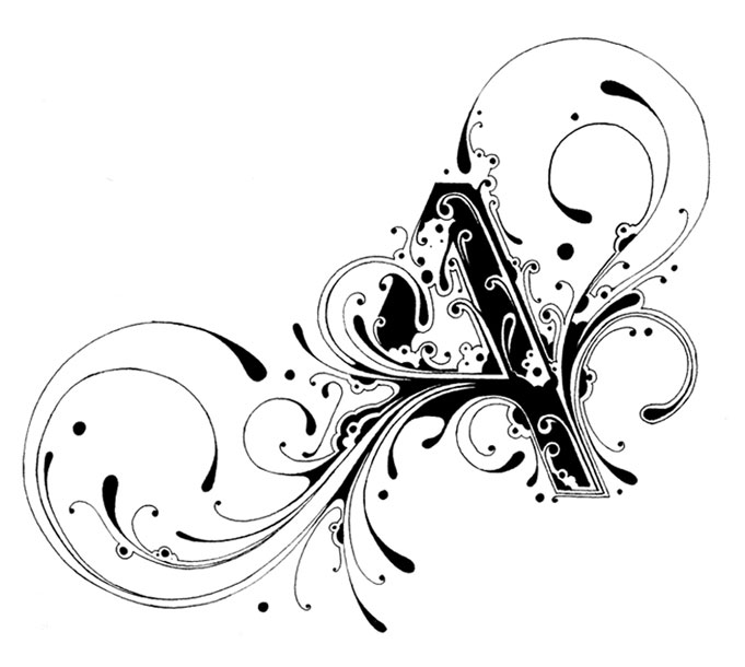
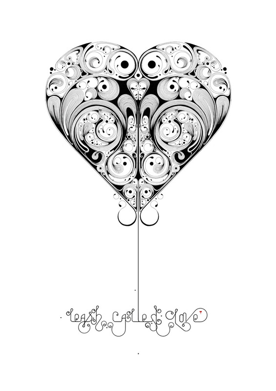
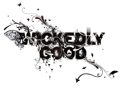
One of my personal favorite designs is when typographic elements are involved to great a image or to enhance an image. Si Scott demonstrates this beautifully. I would say 60% of his work includes floral pieces embedded into simple quotes, words or letter that are usually significant such as 'Freedom' & 'Excellence'.
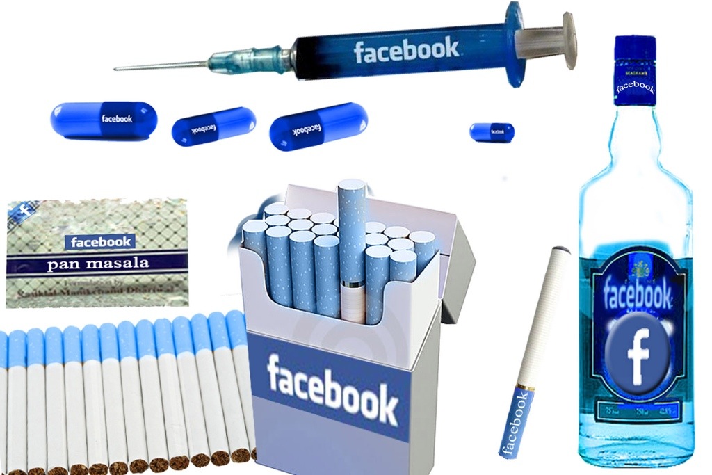
After further thought, we pondered with the thought of including the tagline in the form of a logo. Here are 2 solutions that I designed. 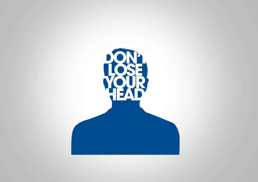
The concept behind this one (above) is pretty simple. I wanted to design something that links both, technology/social media & the concept of 'losing your head'. I chose to include a blue head as it is the same photo that is used by default when you sign up to Facebook and I thought it would be a subtle thing to include considering the nature of the topic. 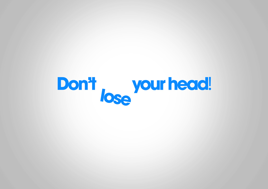
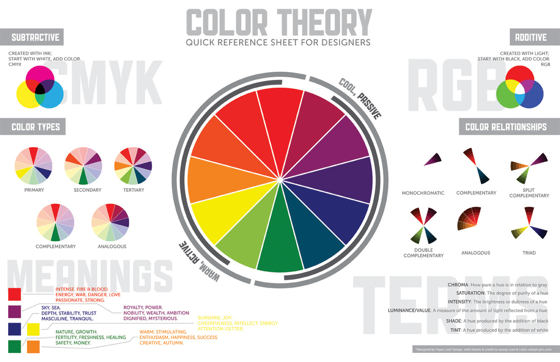
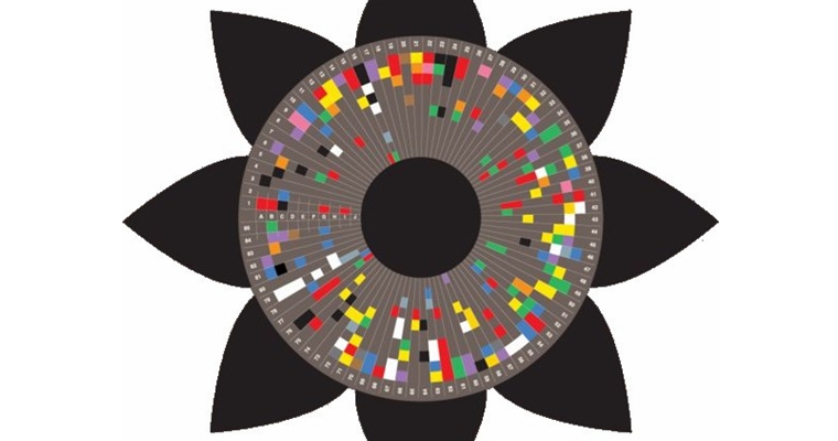
Colour theory is something very important to any person working in the design industry. Colour represent and connote a range of mood, feeling and emotions that is presented and interpreted by the viewer. It can manipulate the view to think or feel a certain way about something. The history of colour theory began along time ago with the invention of the 'Colour Wheel' by Isacc Newton. The colour wheel (above) combines three types of colours which include 'tertiary colours, primary & secondary. This might have been the case when Newton created the wheel, however times have moved on and with the invention of the Personal Computer (PC), have become more complex. the two types of colour, RGB & CMYK have become essensial to graphic designers as the two have separate purposes. CMYK is used primarily for print. CMYK will look different on your screen that it will look when printed. RGB is used mainly for things designed to be displayed on a screen therefore it is created to look better for screen rather printed. 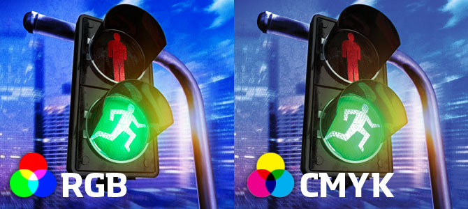
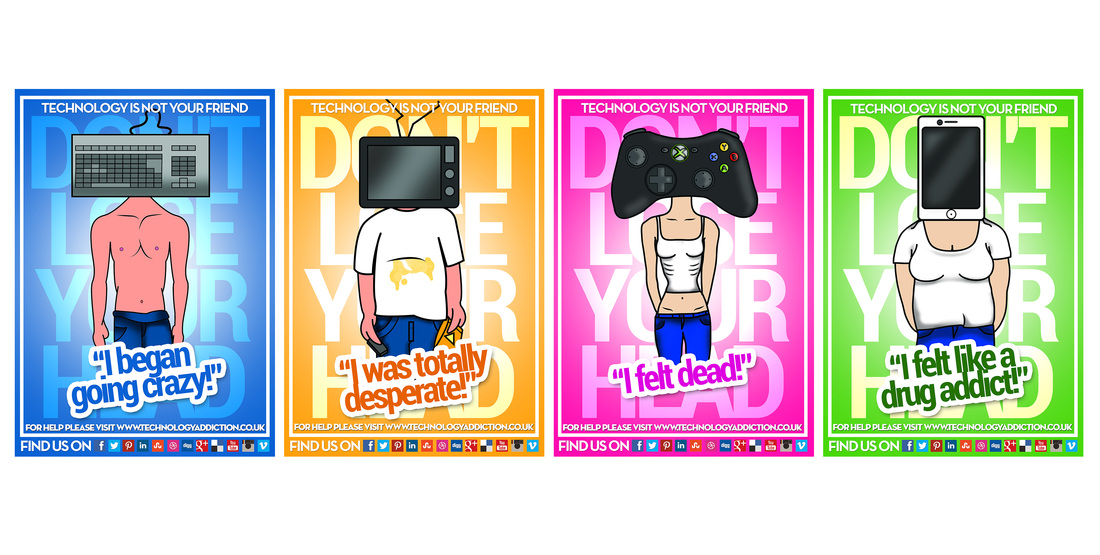
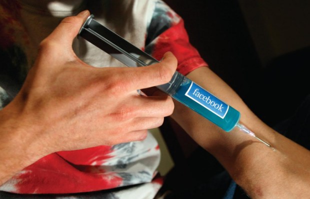
I've been thinking about taglines that can relate to the style that Amber & Andrew thought up a couple of weeks ago. One of the taglines I thought of that I liked was 'Don't lose your head'. I like this as it directly links to Amber's initial design of having characters heads replaced with a phone/TV screen etc... It also relates to people 'losing their heads' in technology. After Andrew posted 2 characters last week I decided to see what the tagline would look like on the pieces. Here's a solution that I did that I really liked so putting it on here to share with the group... 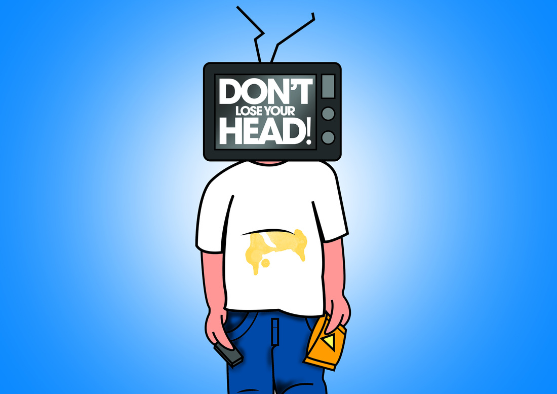
| AuthorWrite something about yourself. No need to be fancy, just an overview. ArchivesMay 2014 Categories |


 RSS Feed